I don't know shite about:
Container Queries in CSS
What are container queries?
Container queries allow you to write CSS that is responsive to the size of the container instead of the size of your screen. They make it possible that components control their responsive styles on their own.
If you enjoy a short video introduction. Here is a (<2min) video explanation to container queries from the State of CSS 2022
How to use container queries?
For basic usage you define an element as your container.
.almighty-sizer-box {
  container-type: inline-size;
}
After that you can define @container queries for your container, similar to the @media queries.
In this case I changed the font size of the box to be responsive to the size of the container and changed the padding and background color for better visual distinction.
@container (max-width: 350px) {
  .almighty-sizer-box .inside {
    background-color: #3a475c;
    padding: 24px 16px;
  }
  .title {
    font-size: 24px;
  }
  .text {
    font-size: 12px;
  }
}
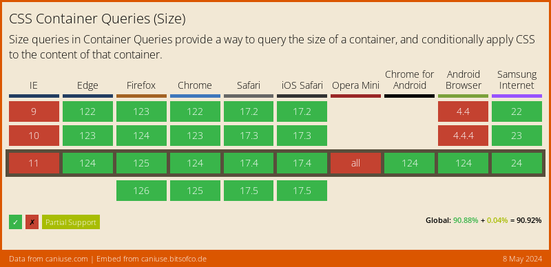
At the publishing date the of this post the browser support for container queries is still "not really there".
If you want to use container queries right now, head over and grab the Polyfill from GoogleChromeLabs, which is compatible with all modern browsers. Sadly at the publishing date of this post I couldn't get the polyfill to work with "named container queries". Hopefully that will change in the future.
Example Usage
In this example I took the .almighty-sizer-box from above and squeezed it into a 200px and a 400px container.
Both boxes are using the same style definition. But through container queries they receive different styles. 🥳
This example runs the GoogleChromeLabs polyfill, so you should see the container queries in action.
If you're longing for a more complex example. Take a look at the Container Queries Example by Una Kravets. I forked the example from codepen to embed the polyfill